Repetition
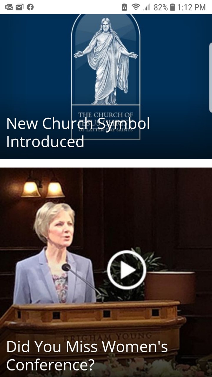
churchofjesuschrist.org

The Church of Jesus Christ.org's website makes good use of repetition in their design. As you can see the same font, the same font color and the same font size is used to title each section and image. It's hard to tell because this screenshot only shows a portion of it, but it continues on in the same way.
White Space
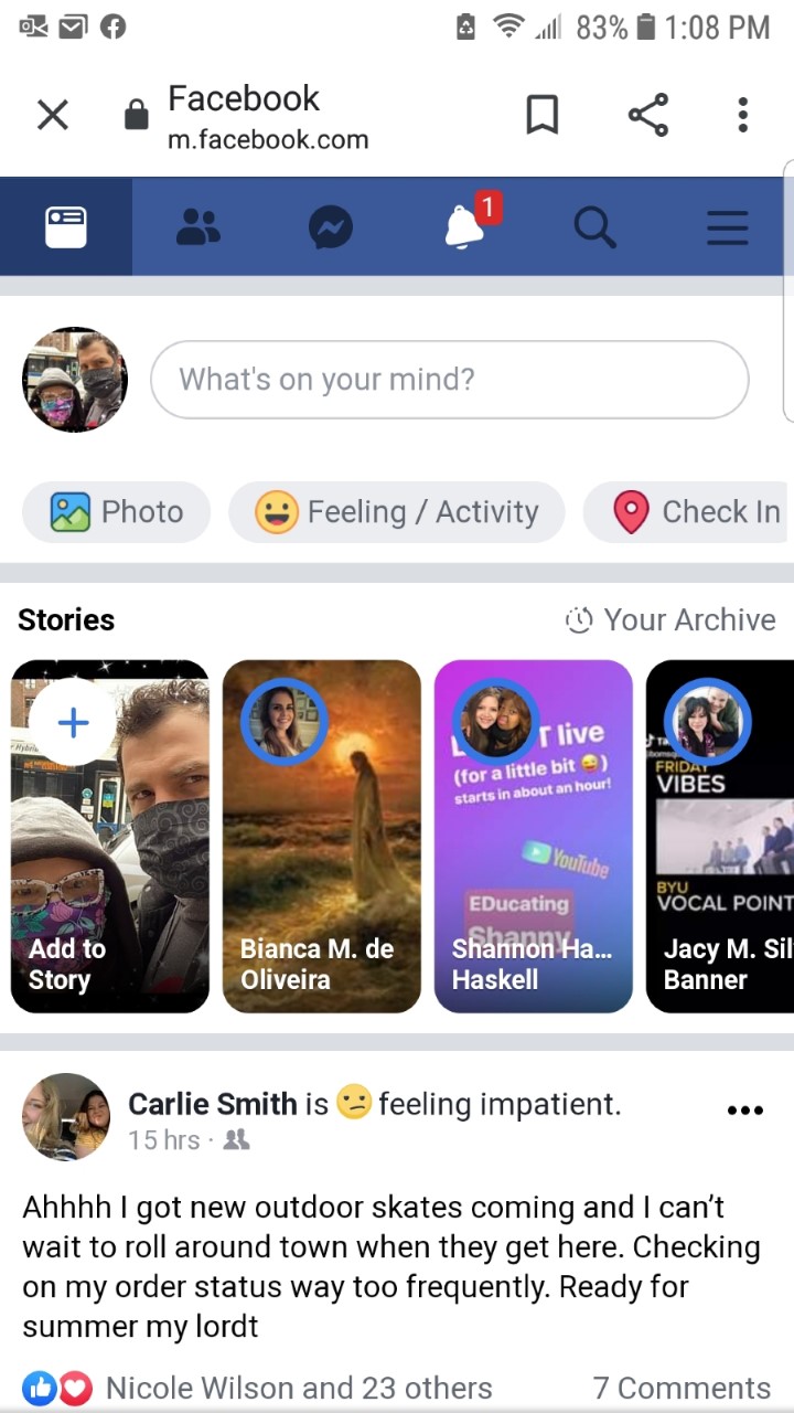
facebook.com

Facebook makes an excellent use of white space. Facebook is endless and goes on forever, so it's very important that it isn't too cluttered. I like the way the images and colors are alternated with white space and text.
Alignment and Visual Hiearchy
my.byui.edu

I think this website is a good example of both Alignment and Visual Hiearchy. Text and boxes are lined up nicely to create order. Things that we are meant to see first are larger and more prominent. Unfortunately, this page isn't very mobile friendly.